Srsly wtf I saw that and immediately thought “Well that would be a great modern logo” its flat and sleek but still recognizable enough. Guess the marketing department didn’t want to admit “we got it right the first time”
Yeah somehow that got worse over time. I remember one version actually let you select multiple windows in the taskbar and choose to horizontally or vertically tile, and if you knew the magic sequence, you could do it for just two not all.

I wanted to use the current Windows logo, but it’s so incredibly stupid, you wouldn’t even recognize it.
This is what happens when a $100 bn profit/year company is too cheap to hire artists:
It’s just the blue screen of death now. Apt.
I think it’s a projection joke. Win12 isn’t even released yet.
12? Even 11 isn’t out yet. Or at least I haven’t heard.
TIL windows 1 logo was the best logo
Srsly wtf I saw that and immediately thought “Well that would be a great modern logo” its flat and sleek but still recognizable enough. Guess the marketing department didn’t want to admit “we got it right the first time”
Even seems to suggest use of a tiling window manager that MS still hasn’t properly implemented.
Yeah somehow that got worse over time. I remember one version actually let you select multiple windows in the taskbar and choose to horizontally or vertically tile, and if you knew the magic sequence, you could do it for just two not all.
There’s also this gem that was used infrequently around 3.0 era. I call it Windows Noir.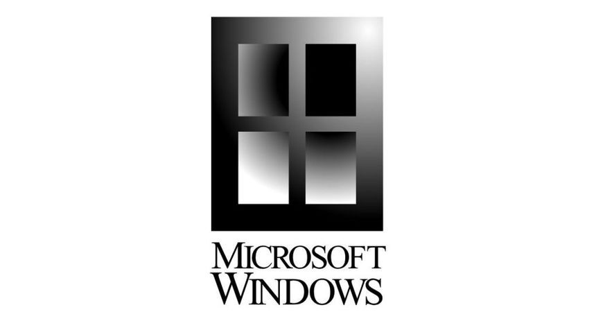
It does kinda look like a cafeteria tray, though.
I like 7 best
Window
s12You think they didn’t pay marketing consultants millions for that logo?