

- cross-posted to:
- technology@lemmy.world
- cross-posted to:
- technology@lemmy.world
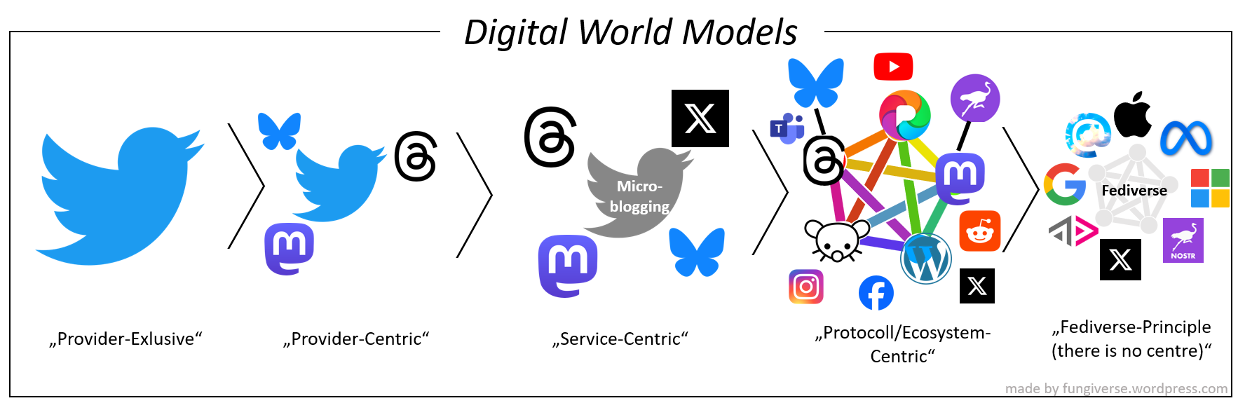
Provider-Exclusive: “There is only the app of my provider.”
Provider-Centric: “There exist other apps, but the one I’m using is the main one.”
Service-Centric: “There is no main one and I’m trying to use the one that fits my ideal the best.”
Protocol/Ecosystem-Centric: “There exist other protocols/ecosystems, but mine is the main one.”
Fediverse-Principle: “There is no main one and I’m trying to use the one that fits my idea of an open ecosystem the best.”
Current state of different web2 apps:

Yeah, I’m no graphic designer but the fediverse logo looks like a nightmare to render at small sizes, which is what designers are looking for in a logo, typically - something that is easy to recognize, tells something about the product, and scales well at all sizes, from favicon to building sized ad. I like that it conveys its own meaning really well, but it’s also extremely busy. So many crossing lines in such a small space just looks like a garbled mess at small sizes. Take this image and scale it down to 16x16px, you can see what I mean.