cross-posted from: https://discuss.tchncs.de/post/13814482
I just noticed that
ezacan now display total disk space used by directories!I think this is pretty cool. I wanted it for a long time.
There are other ways to get the information of course. But having it integrated with all the other options for listing directories is fab.
ezahas features like--git-awareness,--treedisplay, clickable--hyperlink, filetype--iconsand other display, permissions, dates, ownerships, and other stuff. being able to mash everything together in any arbitrary way which is useful is handy. And of course you can--sort=sizedocs:
  --total-size               show the size of a directory as the size of all
                             files and directories inside (unix only)
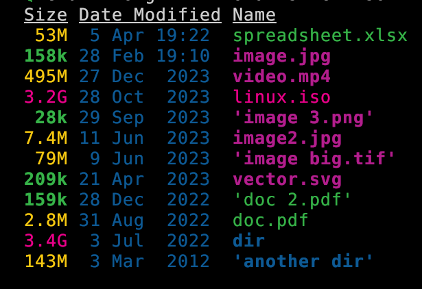
It also (optionally) color codes the information. Values measures in kb, mb, and gb are clear. Here is a screenshot to show that:
eza --long -h --total-size --sort=oldest --no-permissions --no-user
Of course it take a little while to load large directories so you will not want to use by default.
Looks like it was first implemented Oct 2023 with some fixes since then. (Changelog). PR #533 - feat: added recursive directory parser with `–total-size` flag by Xemptuous


Why does ls need a replacement?
What does this do that ls cannot?
Edit: cheers for the downvote for valid questions!! Guess the reddit mindset never leaves some.
It’s subjective, but it looks better
Function is what I want.
good design is a function on its own
better defaults, icons, color coding, and other optional views improve on the functions of the default ls
You do you choom
aside from the subject of the post: the ones I miss when it’s not available are git status/ignoring, icons, tree, excellent color coding.
Here I cloned the
ezarepo and made some random changes.Made some more changes and then combine
gitandtree, something I find is super helpful for overview:(weird icons are my fault for not setting up fonts properly in the terminal.)
Colors all over the place are an innovation that has enabled me to use the terminal really at all. I truly struggle when I need to use b&w or less colorful environments. I will almost always install
ezaon any device even something that needs to be lean. It’s not just pretty and splashy but it helps me correctly comprehend the information.I’d never want to get rid of
lsand I don’t personally alias it to toezabecause I always want to have unimpeded access to the standard tooling. But I appreciate having a few options to do the same task in slightly different ways. And it’s so nice to have all the options together in one application rather than needing a bunch of scripts and aliases and configurations. I don’t think it does anything that’s otherwise impossible but to get on with life it is helpful.Not sure I could get with the huge string of arguments, That needs to be shortened to follow the ls style of stacking letters behind minimal “-”
Does look good but I prefer function to form.
Interesting though
oh of course there are abbreviated forms. I just used the long versions so that people who aren’t framiliar can follow what I am doing without having to spend 10 mins cross referencing the man page.
Likewise in the examples I used options that created a fairly very simple screenshot to clearly illustrate an answer to the question of what
ezadoes thatlsdoesn’t.I tend to use
ezavia a couple of aliases with sets of common preferences. Like in a git dir I want to sort by date. usually don’t need to see the user column, the size or permissions (except when I do). I do want to see the dotfiles. So I have an appropriate line aseg(eza git). A great companion togs.